The Importance of Color Theory in Design: A Comprehensive Guide
Introduction
Color is a powerful tool in the world of design. It can evoke emotions, convey messages, and influence decisions. Understanding the importance of color theory in design is crucial for creating visually appealing and effective designs. In this comprehensive guide, we’ll explore the fundamentals of color theory and how it can elevate your design projects.
Understanding Color Theory Basics
Color theory is the foundation of using color effectively in design. Let’s start by examining the core concepts:
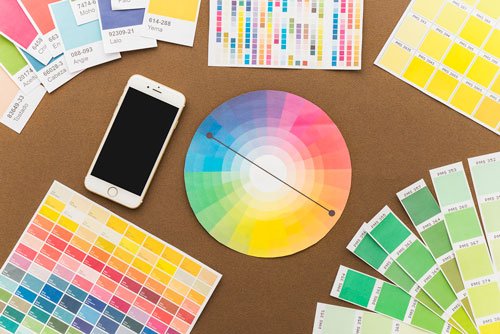
The Color Wheel
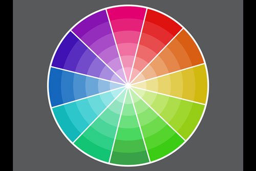
The color wheel is a visual representation of colors arranged according to their chromatic relationship. It consists of:
- Primary colors: Red, blue, and yellow
- Secondary colors: Green, orange, and purple (created by mixing primary colors)
- Tertiary colors: Combinations of primary and secondary colors
Color Properties
Understanding these properties helps designers manipulate colors effectively:
- Hue: The pure color itself
- Saturation: The intensity or purity of a color
- Value: The lightness or darkness of a color
Color Temperature
Colors are often categorized as warm or cool:
- Warm colors: Reds, oranges, and yellows
- Cool colors: Blues, greens, and purples
This classification helps in creating mood and atmosphere in designs.
The Psychology of Colors
Colors have a significant impact on human emotions and behavior. Here’s a brief overview of common color associations:
- Red: Excitement, passion, danger
- Blue: Trust, calmness, stability
- Yellow: Happiness, optimism, energy
- Green: Nature, growth, harmony
- Purple: Luxury, creativity, mystery
- Orange: Enthusiasm, adventure, confidence
- Black: Sophistication, power, elegance
- White: Purity, cleanliness, simplicity
Understanding these psychological effects is crucial when choosing colors for branding, marketing, and user interface design.
Color Harmony and Schemes
Color harmony is about creating visually pleasing color combinations. Some popular color schemes include:
- Monochromatic: Using different shades and tints of a single color
- Analogous: Using colors that are next to each other on the color wheel
- Complementary: Using colors opposite each other on the color wheel
- Triadic: Using three colors equally spaced on the color wheel
- Split-complementary: Using a base color and the two colors adjacent to its complement
Experimenting with these schemes can help you create balanced and attractive designs.
Applying Color Theory in Different Design Fields
The importance of color theory extends across various design disciplines:
Graphic Design
In graphic design, color theory helps in:
- Creating eye-catching logos and brand identities
- Designing effective marketing materials
- Enhancing visual hierarchy in layouts
Web Design
For web designers, color theory is essential for:
- Improving user experience and navigation
- Ensuring readability and accessibility
- Creating cohesive and visually appealing websites
Interior Design
Interior designers use color theory to:
- Set the mood and atmosphere of a space
- Create visual balance and harmony
- Enhance the perceived size and shape of rooms
Fashion Design
In fashion, color theory guides:
- Creating appealing color combinations in outfits
- Designing seasonal collections
- Understanding color trends and forecasts
Common Color Mistakes to Avoid
Even experienced designers can make color-related mistakes. Here are some common pitfalls to watch out for:
- Using too many colors: This can lead to visual chaos. Stick to a limited color palette.
- Ignoring contrast: Poor contrast can make text unreadable and elements indistinguishable.
- Neglecting color accessibility: Ensure your designs are accessible to people with color vision deficiencies.
- Overlooking cultural color associations: Colors can have different meanings in various cultures.
- Inconsistent color usage: Maintain color consistency across your designs for brand recognition.
Tools and Resources for Color Theory
To help you apply color theory effectively, consider using these tools and resources:
- Adobe Color: A free tool for creating color schemes and exploring color harmonies.
- Coolors: A color scheme generator that helps you create and save color palettes.
- ColorZilla: A browser extension for picking colors from web pages.
- Canva Color Wheel: An interactive color wheel to explore color relationships.
- Color Theory for Designers: A comprehensive guide on color theory by Smashing Magazine.
Conclusion
The importance of color theory in design cannot be overstated. It’s a fundamental skill that can significantly improve the quality and effectiveness of your designs. By understanding color relationships, psychology, and application techniques, you can create visually stunning and impactful designs across various fields.
Remember, mastering color theory is an ongoing process. Keep experimenting, learning, and refining your color choices. With practice and attention to detail, you’ll develop a keen eye for color that will set your designs apart.
What’s your favorite color scheme to work with? Share your thoughts and experiences with color theory in the comments below!